The Ultimate Guide to Color Theory for Graphic Designers
- Get link
- X
- Other Apps
In graphic design, colors do more than fill spaces; they shape emotions, influence perceptions, and direct attention. Whether it’s a fiery red that signals urgency or a calming blue that evokes trust, colors can transform how people experience visual content. This makes color theory one of the most important aspects of design, impacting branding, marketing, and overall user experience.
For graphic designers, a strong grasp of color theory is essential. It’s not just about choosing a few colors that look good together. It’s about making intentional choices that create visual harmony, evoke emotions, and reflect a brand’s personality. For graphic design experts in Kolkata or anywhere else in the world, color choices often reflect cultural significance and local sensibilities, adding depth and relevance to their work.
This guide will help both beginner and intermediate designers understand color theory inside out. We’ll cover everything from the basics of color mixing to creating balanced color schemes and the psychological effects of color. By the end, you’ll have the knowledge and tools needed to confidently use color in your design projects.
1. Understanding the Basics of Color Theory
What is Color Theory?
Color theory is a collection of guidelines and principles about how colors interact, how they mix, and how they can evoke certain emotions. This concept dates back centuries, but it evolved significantly in the 20th century with pioneers like Johannes Itten, who created the 12-part color wheel that’s still widely used today. Artists, scientists, and designers have since expanded on these ideas to develop the complex system of color theory we use today.
For graphic designers, understanding color theory is essential. It allows you to create visually pleasing compositions, communicate brand identity, and evoke emotional responses. Good color choices can elevate a design, while poor choices can make even the best layouts appear confusing or unattractive.
Primary, Secondary, and Tertiary Colors
At the heart of color theory lies the color wheel. The basic structure includes primary colors, secondary colors, and tertiary colors:
- Primary Colors: Red, blue, and yellow. These colors cannot be created by mixing others; they’re the foundation of all colors.
- Secondary Colors: Green, orange, and purple. Created by mixing two primary colors.
- Tertiary Colors: A blend of primary and secondary colors, such as red-orange or blue-green.
In digital design, RGB (red, green, blue) becomes the standard for creating colors on screen. Each primary color adds light, and by combining them, designers can create a broad spectrum of colors.
The Color Wheel
The color wheel is a circular arrangement of colors that shows the relationships between primary, secondary, and tertiary colors. Understanding these relationships helps designers create color schemes:
- Complementary: Colors opposite each other on the wheel, like blue and orange, which create high contrast.
- Analogous: Colors next to each other, like blue and green, that blend harmoniously.
- Split-Complementary: A main color paired with the two colors adjacent to its complementary color.
- Triadic: Three colors evenly spaced around the wheel, such as red, yellow, and blue, for balance.
- Tetradic (Double Complementary): Two pairs of complementary colors, like red, green, blue, and orange, offering rich variety.
Each scheme has unique benefits, helping designers achieve different moods and effects in their work.
2. The Psychological Impact of Color
How Colors Affect Emotions and Perceptions
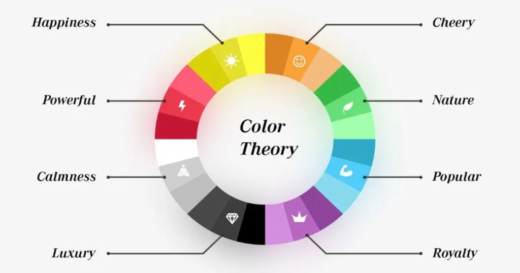
Colors can stir emotions and shape our perceptions, making color psychology a powerful tool in design. Here’s how some popular colors are often perceived:
- Red: Associated with energy, passion, and urgency. It grabs attention quickly, often used in sales and emergency signs.
- Blue: Conveys calm, trust, and professionalism. Blue is a favorite among corporate brands.
- Yellow: Evokes optimism, warmth, and happiness. However, too much can feel overwhelming or cause eye strain.
- Green: Represents nature, health, and tranquility. Green is popular with eco-friendly brands.
- Black: Denotes sophistication, elegance, and power. It’s often used in luxury branding.
Understanding these associations helps designers create visuals that communicate specific messages and moods.
Cultural and Contextual Differences in Color Perception
Colors can hold different meanings across cultures. For example, in Western cultures, white symbolizes purity and is often seen in wedding attire. But in some Asian cultures, white is associated with mourning. Similarly, red is viewed as lucky in China but can symbolize danger or caution in other parts of the world. Designers must consider these cultural differences, especially when working on global brands.
Color Perception in Branding
Brands use color as a powerful way to convey their identity and connect with their audience. Take Coca-Cola for instance—their use of vibrant red represents excitement and energy. Apple leans into minimalism with black and white, which aligns with their sleek, modern products. Color choices like these aren’t random but reflect intentional branding strategies.
3. Color Harmony: How to Create Balanced Color Palettes
The Importance of Color Harmony
Color harmony is all about balance. It’s the art of combining colors in a way that feels cohesive and visually pleasing. Without harmony, designs may feel chaotic or confusing, which distracts from the message.
Types of Color Harmonies
- Complementary Colors: Opposites on the wheel (e.g., red and green). They create strong contrast, perfect for making elements pop.
- Analogous Colors: Neighboring colors (e.g., blue and green), creating a natural, calming effect.
- Triadic Colors: Three evenly spaced colors (e.g., red, yellow, blue), often used to achieve vibrant balance.
- Split-Complementary Colors: A main color and two colors adjacent to its complement, offering balance with softer contrast.
- Tetradic Colors: Two complementary pairs (e.g., orange, blue, red, and green), providing diversity and vibrancy.
Tips for Effective Color Combinations
Use neutral colors, like black, white, and gray, to balance bolder hues and prevent clashing. For tools, Adobe Color Wheel and Coolors.co are excellent for experimenting with palettes and generating harmonious schemes effortlessly.
4. The Role of Color in Different Design Mediums
Digital vs. Print Color Spaces
In digital design, colors are created using the RGB model (Red, Green, Blue), with different intensities combining to form a broad spectrum. Print, however, uses CMYK (Cyan, Magenta, Yellow, and Black). RGB colors appear more vivid on screen, while CMYK is better for accurate color reproduction in print.
Pantone and Spot Colors
The Pantone Matching System (PMS) standardizes colors for printing. Designers use Pantone to ensure color consistency across different printers, which is vital for brand consistency. Spot colors are selected from the Pantone library for accuracy, especially useful for large print runs.
Color Consistency Across Devices
Ensuring consistent colors across screens can be challenging due to differences in screen calibration. By designing with these variations in mind, you can better control the color experience for users across devices.
5. Using Color in Graphic Design Projects
Brand Identity Design
Color is foundational in building a memorable brand identity. Consider McDonald’s with its red and yellow, chosen for their association with appetite and energy. Tiffany & Co. has its iconic blue, which symbolizes luxury and exclusivity. For healthcare brands, blue and green are popular as they convey calm and trust.
Web and App Design
In web design, color affects readability, navigation, and user experience. High-contrast colors enhance readability, especially for call-to-action buttons. Accessibility is another consideration, ensuring colors are legible for users with visual impairments. WCAG guidelines help designers meet contrast standards.
Packaging Design
In packaging, colors can make products more appealing and communicate qualities. Bright colors attract attention on crowded shelves, while muted shades suggest sophistication. Think about how snack brands use vibrant colors to appeal to younger audiences, while luxury items may stick to minimalist color schemes.
6. Color Accessibility: Designing for All Audiences
What is Color Accessibility?
Color accessibility ensures that everyone, including people with visual impairments like color blindness, can use and enjoy your designs. This is particularly crucial in digital design, where users interact with screens.
Color Blindness and How to Design for It
Color blindness types like protanopia (red deficiency), deuteranopia (green deficiency), and tritanopia (blue deficiency) affect how users perceive color. Tools like Color Contrast Checkers and textures or patterns can make designs more accessible.
WCAG Guidelines for Color Contrast
The Web Content Accessibility Guidelines (WCAG) recommend minimum contrast ratios for text and background combinations, improving readability for all users.
7. Advanced Color Theory Concepts for Designers
The Use of Gradients in Design
Gradients can add depth and dimension, especially in web and app design. When using gradients, avoid mixing too many colors or high contrast, which can look harsh on the eyes. Subtle gradients in two similar shades often look elegant.
The Role of Light and Dark Colors
Light colors can create a sense of openness, while dark colors can give designs a more sophisticated or mysterious look. For example, luxury brands often use darker palettes to suggest exclusivity.
Monochromatic Color Schemes
Monochromatic schemes use shades and tints of a single color, creating a harmonious look. They’re ideal for minimalistic designs and help avoid visual clutter.
8. Practical Tips and Tools for Using Color in Design
Color Palettes and Inspiration Tools
For designers, finding and selecting the right colors is key to creating visually appealing and effective designs. The following tools can help with everything from finding inspiration to extracting specific colors from images.
Adobe Color: Adobe Color allows designers to create custom color schemes by experimenting with different color combinations on an interactive color wheel. You can choose from harmony rules like analogous or complementary, making it a great tool for creating balanced color palettes.
Coolors.co: Coolors is a user-friendly tool for quickly generating color palettes. With a simple interface, it allows you to lock favorite colors and explore various combinations by hitting the space bar. This makes it ideal for experimenting and finding fresh inspiration.
Dribbble: Dribbble is an online community where designers showcase their work, making it a valuable source of color inspiration. Browsing designs from other creatives on Dribbble can spark ideas and help you see how different colors look in real-world projects.
Behance: Like Dribbble, Behance is a platform where designers share portfolios and projects. It’s an excellent source of visual inspiration, allowing you to see a variety of design styles and color schemes in action. By following specific designers or projects, you can stay updated on current color trends.
ColorZilla: ColorZilla is a browser extension for Chrome and Firefox that lets you pick colors directly from any website. With its eyedropper tool, you can sample colors from web elements or images, making it easy to pull colors that you find appealing during online browsing.
Adobe Capture: Adobe Capture is a mobile app that enables you to extract color palettes from photos. Simply take a picture, and the app will generate a palette based on the colors in the image. It’s ideal for on-the-go inspiration, allowing designers to capture colors from everyday life and add them to their library for future projects.
Color Guidelines for Designers
When creating color palettes, it’s best to focus on a limited color range to avoid overwhelming the design. Stick to a cohesive palette that includes neutrals for balance and contrast, and avoid too many bright or clashing colors. This not only enhances the visual appeal but also ensures a professional look that communicates your intended message clearly.
Conclusion
Mastering color theory is more than just picking attractive hues; it’s about creating experiences, setting emotional tones, and enhancing the usability of designs. When designers understand the principles of color, they can shape visuals that are not only beautiful but also meaningful and effective. This knowledge allows them to evoke emotions, convey brand identity, and guide the viewer’s eye—all with the power of color.
For designers looking to dive even deeper, continued learning is a must. Color theory is a rich, ever-evolving field, and there are endless ways to expand your understanding. Online courses, workshops, and design books offer valuable insights, while hands-on experimentation in real projects builds practical skills. With each new project, your grasp of color will improve, allowing you to apply more advanced techniques and create truly compelling designs.
Color theory is a journey, and like any skill, it grows stronger with time and practice. Keep experimenting, keep refining, and keep pushing the boundaries of your color choices. By embracing color theory, you’ll enhance not only the impact of your designs but also the stories you can tell visually.
Happy designing, and may your colors always be on point!
- Get link
- X
- Other Apps


Comments
Post a Comment